I’ve been trying to figure out the best way to filter out population density from the spread of the Covid-19 coronavirus. It’s difficult, and I realized it’s taken me long enough that it’s been almost a month since I made anything. So I figured out a way to create something while working: generate an animation that requires an hour or two of background computation while I drink a beer focus on multidimensional feature spaces.
I integrated my love of Covid-19 analysis and my love of rotating spheres… so here’s an animation of Covid-19 deaths per capita by country around the world. I realize that’s probably too many consecutive prepositional phrases, but I can’t think of a pithier way to say it.
I capped deaths at 30 per 100,000 people for color contrast purposes (in other words the scale is from 0 to 30+ deaths/100,000). The .gif will pause on the last frame for a bit then begin again and keep rotating, FOREVER. A brief description of my process is at the bottom of this post.
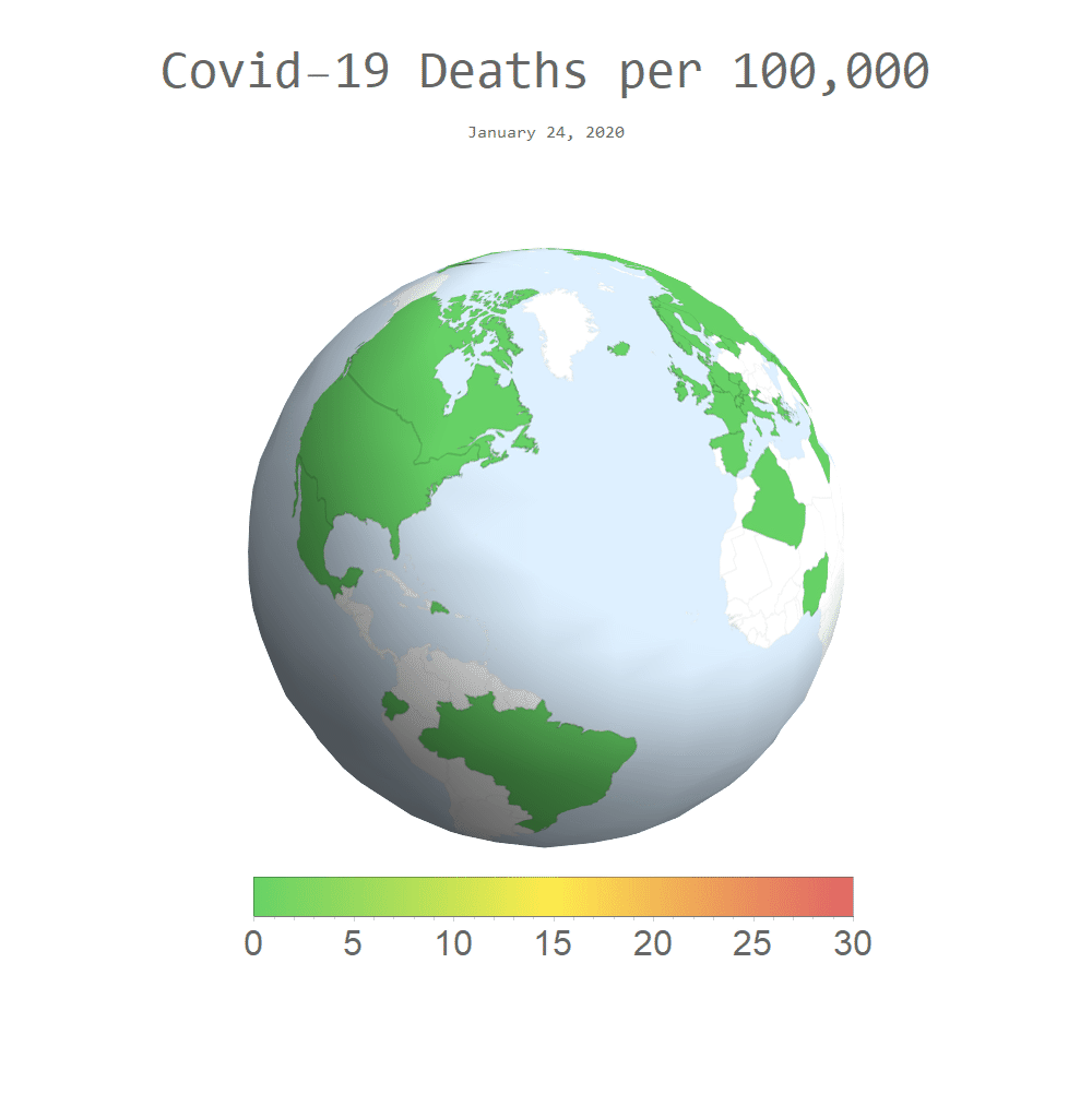
I pulled the data from the European Centre for Disease Control, as my previous global Covid-19 posts. I first generated 2-D maps of global Covid-19-related deaths per capita, by country. Then, using essentially the same parametric texture-wrapping algorithm as in my very first blog post, I plastered each map around a sphere. That created a large set of 3-D graphics, to each of which I applied a recursive geometric transform. From there it was a simple matter to animate that list of images into the above .gif.

Can you slow it down?????
LikeLike
Here’s a slower version: https://imgur.com/a/nED6OuT It was really hard to resist the temptation to link you to a static image 😛
LikeLike
Cool! I was just kidding about slowing down the world of deaths. Cool again
L, Mom
LikeLike